Desktop Prepress Guidelines
Programs"Good" ProgramsThere are literally hundreds of programs on the market that can produce text and graphics. However, only a select few are appropriate for professional publishing. See our Program Listing chart for information on what programs and versions we support. "Bad" ProgramsWhat do we mean by "bad" programs? These are applications that produce unreliable and/or unpredictable results. Also included in this list are programs that are known to require extensive rework to get them to output pages to PostScript™ printers. This does not mean we are unwilling to work with some of these programs. But... you can expect additional charges and sometimes they can grow exponentially as problems mount. There is no guarantee that the final proof will look like what you have in the original document. It may be less expensive to completely re-create the document than work through the problems with these applications. The best way to avoid this situation is to stick with one of the "approved" programs. Frequently we find that the costs associated with problems from these programs would easily have purchased a more professional product like QuarkXpress or In-Design.
Properties of a "Bad" program include...
Color production is unreliable
Program only supports RGB colors (not CMYK or Spot Colors)
Type rewraps without warning and unpredictably
Resolution of images is poor
Produces errors when attempting to print to PostScript devices
Takes exceptionally long to output proper files
Costs the customer extra money due to problems!
Programs to Avoid
Microsoft Word
Microsoft Excel
Microsoft Publisher
Microsoft Powerpoint
WordPerfect (not supported at all)
Photographs
Should be 300 dpi resolution at 100% size.
Images that are to be enlarged need to either be scanned at the correct size or need greater than 300 dpi resolution.
Color images should be in CMYK color format. Not RGB.
Grey Scale images should be in Grey Scale format. Not RGB.
Pure Black & White images should be bitmap B&W images and saved as TIFF or EPS.
Bitmap B&W images should be at least 600 dpi at 100% size. Preferred to be 800 to 1200 dpi.
Images should be saved as EPS, TIFF or JPG file formats only. (Not WMF, WBM, or any other format!)
Do not "over-res" images. In other words, don't use a 500 dpi color image at 100% size. You will only have a huge file that will give no greater quality.
Do not create or edit clipping paths within Quark Xpress. Create all clipping paths in PhotoShop and save the image as EPS.
If creating a duotone, do not use "flat" curves. We recommend that you use a reference like the Pantone Duotone Guide.
Do not create silhouettes by "deleting" to a white background unless you intend to place the image on a pure white background within your page layout program. You must use a clipping path for this.
Keep clipping paths simple. Make sure that the path is placed at least 2 pixels WITHIN the colored area of your image to prevent edge halos.
Do not use the STYLE menu to edit ANY images in Quark.
FontsALL fonts used should be sent in on a disk with the rest of the job. Failure to do so will result in delays and possibly extra charges.Type 1 fonts Are preferred because they cause the fewest problems on both PC and Mac.TrueType fontsAlthough we accept them, they are known to cause output problems occasionally. We recommend avoiding TrueType fonts.OpenType FontsThis is a new font type. So far we have seen no problems with OpenType fonts, however, it is a new format and some problems may still show up in the future.Bitmap FontsNOT usable- these are some of the standard fonts with windows.OSX .dfontsMacintosh OSX intruduced a new font type called .dfont. Currently we do not support these fonts since they only operate in OSX. Due to compatibility issues, we do not currently use OSX for any production work. We will substitute any .dfont with the corresponding postscript font.Keyboard commands for BOLD, ITALICS, and BOLD ITALICSAlthough most any font can be made to appear bold or italics on the screen and even on your printer, the only way to guarantee that the fonts will operate properly when output to film is to choose the font from the font menu. Choosing BOLD, ITALICS, OR BOLD ITALICS from the STYLE menu in any program may result in bad proofs and wasted money!
Avoid "cheap" fonts. Use Fonts from reputable companies. You often get what you pay for with fonts. Many cheap fonts do not handle letter spacing properly and may not print at all on the Imagesetter. (Even if it printed fine on a laser)
Avoid Multiple Master Fonts from Adobe.
NOTE: Font problems are the MOST COMMON causes of delays and problems with a job!
Placing Images in Page Layout Programs
Do not embed graphics into any program. When placing graphics in PageMaker, always choose "NO" when asked "...Include complete copy in the publication...". Choosing YES causes PageMaker to embed the graphic in the document. All graphics need to be sent separately.
If placing images in Corel Draw, FreeHand or Adobe Illustrator documents, those images are embedded automatically. Be sure to send us each image separately so that, if needed, we can make changes and corrections to your documents.
Never COPY and PASTE images from any program into your page layout program.
Make sure you fill picture boxes with "White" when importing TIFF files into Quark Xpress. Do not fill the picture box with "NONE". Doing so will cause jagged edges.
Do not reduce images more that 30% if possible. This causes the file to take longer to output and can cause some images to loose quality.
Always keep in mind what happens to resolution when enlarging or reducing images. A 300 dpi image enlarged 200% becomes a 150 dpi image. The same image reduced 50% becomes a 600 dpi image.
Placing images that are way too large and reducing them (50% or less) may result in extended processing times and extra fees. It is especially important to place images at 100% size at 300 dpi when the images are repeated multiple times on the same page or on multiple pages.
Rotating Images is OK to do in most cases. Images with lots of detail will sometimes loose quality when rotated in a page layout program. If you are concerned about this, rotate in PhotoShop.
Do not save multi-layered .tif files. Tiff files must have a single layer (be flattened) and should have no extra alpha channels. If you need extra channels, the file should be a DCS/EPS file.
Transparency in PhotoShop does not exist once the file has been saved as .eps or .tif. To achieve the effect of transparency, you should create a clipping path and save the file as an .eps document.
In-Design users can achieve transparency by placing a native PhotoShop file with transparency. Although this works, use with extreme caution. This method has been known to cause serious problems and delays if used inappropriately or excessively.
Use the Right Program for the JobUse Quark Xpress, PageMaker or InDesign for laying out pages. This is especially important on multi-page jobs. Using drawing programs like FreeHand, Illustrator, or Corel Draw to lay out pages with photographs and columns of text is NOT reccommended. These programs often take lots of extra time to output files and can cost extra for the additional time needed to produce the job. They also tend to grow VERY large and are hard to manage.The same is true for PhotoShop. Now with the adition of vectored text in PhotoShop, we are seeing a lot of files where the entire page is created in PhotoShop. Although this works, vectored text pages are considerably larger than they would be if done in a page layouit program with the photos proplerly placed. As a result, output times increase.Using these programs for single page ads is fine. Sometimes complicated die-cut or tri-fold brochures are difficult to do in the normal page layout programs and are easier to produce with Illustrator, but most jobs are better off being done in a page layout program.We have seen jobs that were estimated for 3-4 hours of output time jump to 8-10 hours or more because the job was done in PhotoShop or a drawing program. Also, the number of problems increase with these programs and changes or corrections can take longer to do.Multi-Page Freehand or Corel Draw files take an extra long time to produce. All files created in these programs should be saved as an .eps and placed in a page layout program for output. If doing an entire job in a drawing program or PhotoShop, make sure the job is estimated that way to account for the extra time needed to produce the job. If not, you will likely get additional charges.
Page Sizes & Page Design
Set up you page size in your document to be the FINAL TRIM size of a single page. If you want a 8.5 x 11 brochure, set up your pages to exactly that size. If it is a 5 x 7 postcard, set it to 5 x 7.
Make sure all items that are to Bleed (run off the page) extend beyond the page boundary by at least 1/8 inch. Do not make your pages larger to accommodate the extra size.
If you are designing a document that will fold, it is very important that you talk with your sales associate about exactly where the folds need to be in the document. Otherwise, you may have to re-design your document to fit the folding!
Set your pages as single pages in a regular printing order of page 1, page 2, page 3 etc. Do not set the document in "Printer Spreads".
It is OK to separate the document into several files. Example: Bruchure_Cover.qxd, Brochure_01-30.qxd, Brochure_31-50.qxd, Brochure_51-75.qxd. However, a separate document for each page is a very bad idea! This will cause delays and cost overruns on your job.
If you have odd-size pages or inserts, create them in a separate document. For example, if you have an 8.5 x 11 document with a 11x17 foldout, produce the foldout on a separate document.
Die lines should be set as a separate spot color named "Z_die" using the color formula of (Cyan: 0%, magenta: 10%, Yellow: 100%, Black: 25%). They can be created in Illustrator or Freehand and imported into the page layout program or can be created directly within the layout program. Set the spot color to OVERPRINT.
Spot Varnishes should setup as a separate spot color. Many customers prefer to allow us to create the varnish plates to avoid problems. Be sure to tell us EXACTLY what you want varnished.
Avoid placing text or objects within 1/8 inch of the edge of the page unless it is a photo or graphic that will bleed off the page.
Colors
Understand the difference between a spot color job and a 4 color process job. Make sure all color formulas are what you want and that you have checked the formula against a standard swatchbook like the Pantone CMYK book.
Pantone has changed some of their color formulas in the lasy year. Quark 5 has DIFFERENT colors than version 4 did. Always check the color formulas against the Pantone Solid To Process book.
Make sure any spot colors are named the same within all files being used. If you have a color named "Pantone 300 CV" in one document and "Pantone 300 CVC" in a graphic, you will get two different colors!
Remove any unused colors from your documents. This reduces confusion and helps assure you get exactly what you want.
Do not colorize EPS images in PageMaker. If you need an .eps image to be a different color, it needs to be edited in the original program.
To be sure you are getting what you want from a spot color job, we recommend printing a set of color separated lasers. Examine them to make sure your spot colors are on the correct plates.
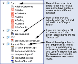
Job OrganizationMake sure you do not have ANY two files with the same name, even if they are in different folders. This will cause serious problems when we re-link the images in preparation for outputting the file! Organize job files cleanly. We recommend a folder structure like so...
Sending in Your Job
Include all layout documents and each linked/imported image.
Include ALL fonts used in your document and any imported images. Be sure to include all weight and styles used. (Bold, Italics, Extra Bold etc.)
Include any NATIVE FreeHand, Illustrator, PhotoShop (layered) or Corel Draw files that were used to create placed EPS or TIFF images. This can save a lot of time should we need to edit or correct a file!
A set of FINAL lasers at 100% size are REQUIRED. We must have a complete full size set of lasers to insure type has not re-wrapped or images have not moved or changed. This is an important quality check point. A PDF with ALL fonts imbedded can be sent to be used as a laser proof. Please name the PDF "jobname_laserproof.pdf" so we will know what it is for.
Be sure to mark lasers wherever FPO (For position Only) images or PICKUP images are located. It is also a good idea to place a non-printing text box in the layout to mark FPO and PICKUP images.
We offer several methods for electronic transfer of files such as Mass Transit, FTP and Email. See the Files Upload section of this website for more information.
Files on disk can be submitted on:
Floppy Disk (3.5" HD)
CD-ROM
DVD-ROM
Zip 100mb or 250mb
Firewire or USB external hard drives (please include all drivers)
Warning: We can no longer read SYQUEST or 600mb Optical cartridges
Programs Supported
Fully Supported
Serious Problems
Supported - Upgrade Preferred
Problems Almost Guaranteed!
Old version - You Need to Upgrade!
Not SupportedNOTE: Every program has the potential to cause problems or time consuming issues. Even fully supported applications can have issues that may result in additional charges or delays. Programs not listed are not supported.
Prepress Supported Program List
Program
Latest Version
Previous Versions
Adobe InDesign
CS
2.0.3
< 2.0
QuarkXpress
6.5
5.05
4.11
< 3.0
PageMaker
7.0
6.5
6.0
5.0
< 5.0
Adobe Illustrator
CS
10.03
9.0
< 8.0
Macromedia FreeHand
MX
10.0
9.0
8.0
< 7.0
Adobe Photoshop
CS
7.0
6.01
6.0
< 5.0
Adobe Acrobat
7.0
6.0
5.05
< 5.0
FileMaker Pro
6.0
5.5
5.0
< 3.0
Corel Draw MacCorel DrawPC
11.012.0
10.011.0
< 10.010.0
< 10.0
Corel PhotoPaint
Any Version
Microsoft Word
Any Version
Microsoft Excel
Any Version
Microsoft PowerPoint
Any Version
Microsoft Publisher
Any Version
Adobe FrameMaker
Any Version
Properties of a "Bad" program include...
Color production is unreliable
Program only supports RGB colors (not CMYK or Spot Colors)
Type rewraps without warning and unpredictably
Resolution of images is poor
Produces errors when attempting to print to PostScript devices
Takes exceptionally long to output proper files
Costs the customer extra money due to problems!
Programs to Avoid
Microsoft Word
Microsoft Excel
Microsoft Publisher
Microsoft Powerpoint
WordPerfect (not supported at all)
Photographs
Should be 300 dpi resolution at 100% size.
Images that are to be enlarged need to either be scanned at the correct size or need greater than 300 dpi resolution.
Color images should be in CMYK color format. Not RGB.
Grey Scale images should be in Grey Scale format. Not RGB.
Pure Black & White images should be bitmap B&W images and saved as TIFF or EPS.
Bitmap B&W images should be at least 600 dpi at 100% size. Preferred to be 800 to 1200 dpi.
Images should be saved as EPS, TIFF or JPG file formats only. (Not WMF, WBM, or any other format!)
Do not "over-res" images. In other words, don't use a 500 dpi color image at 100% size. You will only have a huge file that will give no greater quality.
Do not create or edit clipping paths within Quark Xpress. Create all clipping paths in PhotoShop and save the image as EPS.
If creating a duotone, do not use "flat" curves. We recommend that you use a reference like the Pantone Duotone Guide.
Do not create silhouettes by "deleting" to a white background unless you intend to place the image on a pure white background within your page layout program. You must use a clipping path for this.
Keep clipping paths simple. Make sure that the path is placed at least 2 pixels WITHIN the colored area of your image to prevent edge halos.
Do not use the STYLE menu to edit ANY images in Quark.
FontsALL fonts used should be sent in on a disk with the rest of the job. Failure to do so will result in delays and possibly extra charges.Type 1 fonts Are preferred because they cause the fewest problems on both PC and Mac.TrueType fontsAlthough we accept them, they are known to cause output problems occasionally. We recommend avoiding TrueType fonts.OpenType FontsThis is a new font type. So far we have seen no problems with OpenType fonts, however, it is a new format and some problems may still show up in the future.Bitmap FontsNOT usable- these are some of the standard fonts with windows.OSX .dfontsMacintosh OSX intruduced a new font type called .dfont. Currently we do not support these fonts since they only operate in OSX. Due to compatibility issues, we do not currently use OSX for any production work. We will substitute any .dfont with the corresponding postscript font.Keyboard commands for BOLD, ITALICS, and BOLD ITALICSAlthough most any font can be made to appear bold or italics on the screen and even on your printer, the only way to guarantee that the fonts will operate properly when output to film is to choose the font from the font menu. Choosing BOLD, ITALICS, OR BOLD ITALICS from the STYLE menu in any program may result in bad proofs and wasted money!
Avoid "cheap" fonts. Use Fonts from reputable companies. You often get what you pay for with fonts. Many cheap fonts do not handle letter spacing properly and may not print at all on the Imagesetter. (Even if it printed fine on a laser)
Avoid Multiple Master Fonts from Adobe.
NOTE: Font problems are the MOST COMMON causes of delays and problems with a job!
Placing Images in Page Layout Programs
Do not embed graphics into any program. When placing graphics in PageMaker, always choose "NO" when asked "...Include complete copy in the publication...". Choosing YES causes PageMaker to embed the graphic in the document. All graphics need to be sent separately.
If placing images in Corel Draw, FreeHand or Adobe Illustrator documents, those images are embedded automatically. Be sure to send us each image separately so that, if needed, we can make changes and corrections to your documents.
Never COPY and PASTE images from any program into your page layout program.
Make sure you fill picture boxes with "White" when importing TIFF files into Quark Xpress. Do not fill the picture box with "NONE". Doing so will cause jagged edges.
Do not reduce images more that 30% if possible. This causes the file to take longer to output and can cause some images to loose quality.
Always keep in mind what happens to resolution when enlarging or reducing images. A 300 dpi image enlarged 200% becomes a 150 dpi image. The same image reduced 50% becomes a 600 dpi image.
Placing images that are way too large and reducing them (50% or less) may result in extended processing times and extra fees. It is especially important to place images at 100% size at 300 dpi when the images are repeated multiple times on the same page or on multiple pages.
Rotating Images is OK to do in most cases. Images with lots of detail will sometimes loose quality when rotated in a page layout program. If you are concerned about this, rotate in PhotoShop.
Do not save multi-layered .tif files. Tiff files must have a single layer (be flattened) and should have no extra alpha channels. If you need extra channels, the file should be a DCS/EPS file.
Transparency in PhotoShop does not exist once the file has been saved as .eps or .tif. To achieve the effect of transparency, you should create a clipping path and save the file as an .eps document.
In-Design users can achieve transparency by placing a native PhotoShop file with transparency. Although this works, use with extreme caution. This method has been known to cause serious problems and delays if used inappropriately or excessively.
Use the Right Program for the JobUse Quark Xpress, PageMaker or InDesign for laying out pages. This is especially important on multi-page jobs. Using drawing programs like FreeHand, Illustrator, or Corel Draw to lay out pages with photographs and columns of text is NOT reccommended. These programs often take lots of extra time to output files and can cost extra for the additional time needed to produce the job. They also tend to grow VERY large and are hard to manage.The same is true for PhotoShop. Now with the adition of vectored text in PhotoShop, we are seeing a lot of files where the entire page is created in PhotoShop. Although this works, vectored text pages are considerably larger than they would be if done in a page layouit program with the photos proplerly placed. As a result, output times increase.Using these programs for single page ads is fine. Sometimes complicated die-cut or tri-fold brochures are difficult to do in the normal page layout programs and are easier to produce with Illustrator, but most jobs are better off being done in a page layout program.We have seen jobs that were estimated for 3-4 hours of output time jump to 8-10 hours or more because the job was done in PhotoShop or a drawing program. Also, the number of problems increase with these programs and changes or corrections can take longer to do.Multi-Page Freehand or Corel Draw files take an extra long time to produce. All files created in these programs should be saved as an .eps and placed in a page layout program for output. If doing an entire job in a drawing program or PhotoShop, make sure the job is estimated that way to account for the extra time needed to produce the job. If not, you will likely get additional charges.
Page Sizes & Page Design
Set up you page size in your document to be the FINAL TRIM size of a single page. If you want a 8.5 x 11 brochure, set up your pages to exactly that size. If it is a 5 x 7 postcard, set it to 5 x 7.
Make sure all items that are to Bleed (run off the page) extend beyond the page boundary by at least 1/8 inch. Do not make your pages larger to accommodate the extra size.
If you are designing a document that will fold, it is very important that you talk with your sales associate about exactly where the folds need to be in the document. Otherwise, you may have to re-design your document to fit the folding!
Set your pages as single pages in a regular printing order of page 1, page 2, page 3 etc. Do not set the document in "Printer Spreads".
It is OK to separate the document into several files. Example: Bruchure_Cover.qxd, Brochure_01-30.qxd, Brochure_31-50.qxd, Brochure_51-75.qxd. However, a separate document for each page is a very bad idea! This will cause delays and cost overruns on your job.
If you have odd-size pages or inserts, create them in a separate document. For example, if you have an 8.5 x 11 document with a 11x17 foldout, produce the foldout on a separate document.
Die lines should be set as a separate spot color named "Z_die" using the color formula of (Cyan: 0%, magenta: 10%, Yellow: 100%, Black: 25%). They can be created in Illustrator or Freehand and imported into the page layout program or can be created directly within the layout program. Set the spot color to OVERPRINT.
Spot Varnishes should setup as a separate spot color. Many customers prefer to allow us to create the varnish plates to avoid problems. Be sure to tell us EXACTLY what you want varnished.
Avoid placing text or objects within 1/8 inch of the edge of the page unless it is a photo or graphic that will bleed off the page.
Colors
Understand the difference between a spot color job and a 4 color process job. Make sure all color formulas are what you want and that you have checked the formula against a standard swatchbook like the Pantone CMYK book.
Pantone has changed some of their color formulas in the lasy year. Quark 5 has DIFFERENT colors than version 4 did. Always check the color formulas against the Pantone Solid To Process book.
Make sure any spot colors are named the same within all files being used. If you have a color named "Pantone 300 CV" in one document and "Pantone 300 CVC" in a graphic, you will get two different colors!
Remove any unused colors from your documents. This reduces confusion and helps assure you get exactly what you want.
Do not colorize EPS images in PageMaker. If you need an .eps image to be a different color, it needs to be edited in the original program.
To be sure you are getting what you want from a spot color job, we recommend printing a set of color separated lasers. Examine them to make sure your spot colors are on the correct plates.
Job OrganizationMake sure you do not have ANY two files with the same name, even if they are in different folders. This will cause serious problems when we re-link the images in preparation for outputting the file! Organize job files cleanly. We recommend a folder structure like so...
Sending in Your Job
Include all layout documents and each linked/imported image.
Include ALL fonts used in your document and any imported images. Be sure to include all weight and styles used. (Bold, Italics, Extra Bold etc.)
Include any NATIVE FreeHand, Illustrator, PhotoShop (layered) or Corel Draw files that were used to create placed EPS or TIFF images. This can save a lot of time should we need to edit or correct a file!
A set of FINAL lasers at 100% size are REQUIRED. We must have a complete full size set of lasers to insure type has not re-wrapped or images have not moved or changed. This is an important quality check point. A PDF with ALL fonts imbedded can be sent to be used as a laser proof. Please name the PDF "jobname_laserproof.pdf" so we will know what it is for.
Be sure to mark lasers wherever FPO (For position Only) images or PICKUP images are located. It is also a good idea to place a non-printing text box in the layout to mark FPO and PICKUP images.
We offer several methods for electronic transfer of files such as Mass Transit, FTP and Email. See the Files Upload section of this website for more information.
Files on disk can be submitted on:
Floppy Disk (3.5" HD)
CD-ROM
DVD-ROM
Zip 100mb or 250mb
Firewire or USB external hard drives (please include all drivers)
Warning: We can no longer read SYQUEST or 600mb Optical cartridges
Programs Supported
Fully Supported
Serious Problems
Supported - Upgrade Preferred
Problems Almost Guaranteed!
Old version - You Need to Upgrade!
Not SupportedNOTE: Every program has the potential to cause problems or time consuming issues. Even fully supported applications can have issues that may result in additional charges or delays. Programs not listed are not supported.
Prepress Supported Program List
Program
Latest Version
Previous Versions
Adobe InDesign
CS
2.0.3
< 2.0
QuarkXpress
6.5
5.05
4.11
< 3.0
PageMaker
7.0
6.5
6.0
5.0
< 5.0
Adobe Illustrator
CS
10.03
9.0
< 8.0
Macromedia FreeHand
MX
10.0
9.0
8.0
< 7.0
Adobe Photoshop
CS
7.0
6.01
6.0
< 5.0
Adobe Acrobat
7.0
6.0
5.05
< 5.0
FileMaker Pro
6.0
5.5
5.0
< 3.0
Corel Draw MacCorel DrawPC
11.012.0
10.011.0
< 10.010.0
< 10.0
Corel PhotoPaint
Any Version
Microsoft Word
Any Version
Microsoft Excel
Any Version
Microsoft PowerPoint
Any Version
Microsoft Publisher
Any Version
Adobe FrameMaker
Any Version
posted by Muhammed Naumaan Shah at 8:10 AM
![]()
![]()

0 Comments:
Post a Comment
<< Home